Introduction
Your website frequently serves as the initial point of contact between customers and your brand in this digitally-first era. A digital brochure is not the only thing it is; it is a dynamic, ever-changing experience that embodies your professionalism, values, and vision. You need to make your website responsive and scalable if you want it to stand out.
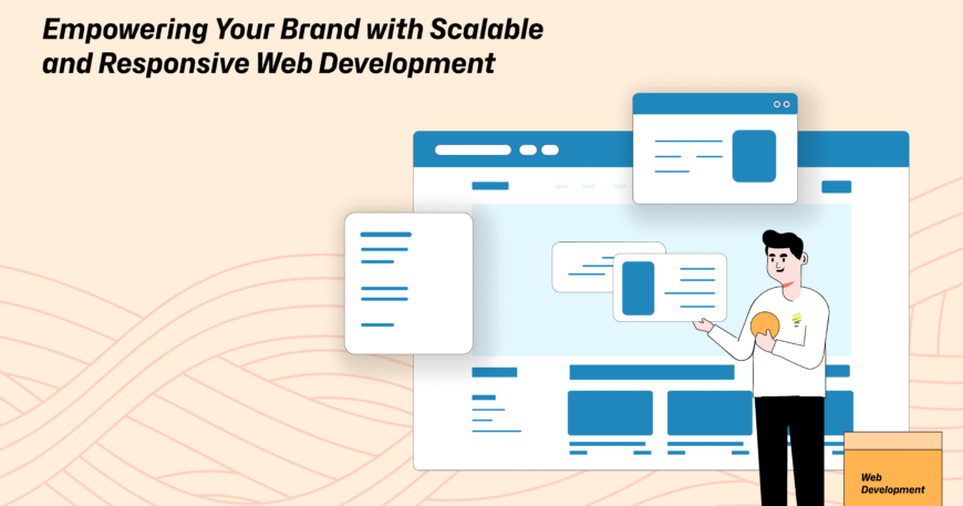
Why Scalable and Responsive Web Development Matters
1. Scalability: Your website should expand along with your business. The foundation of a scalable website is a flexible architecture that permits feature additions, updates, and growing user demand without causing performance problems. This implies that you can begin small and become large, adjusting to shifts in the market, new product launches, or higher traffic levels without starting again.Real-time Example: An edtech business started out with a simple online learning platform that could accommodate ten classes. With no lag or outage, the website expanded to accommodate more than 1,000 courses, user profiles, live chat, and video conferencing tool integrations as demand increased. Through every stage of growth, a seamless transition was guaranteed by the scalable infrastructure.
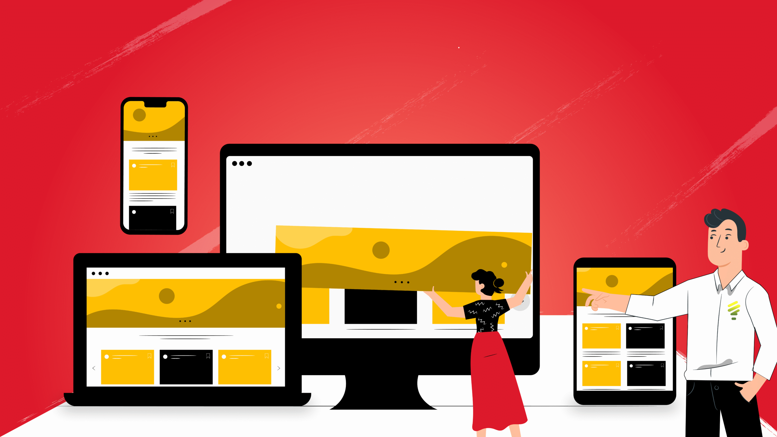
2. Responsiveness: It is now essential to have a responsive design because mobile devices account for more than 60% of all web traffic. Using responsive development guarantees that your website works and looks great on PCs, tablets, and smartphones. This improves user experience, lowers bounce rates, and raises search engine results.
Real-time Example: A regional hospital discovered that the majority of visitors were using mobile devices to access its website, particularly to make appointments. They noticed a 50% boost in mobile appointment bookings and a 20% increase in average time spent on the site after making the switch to a completely responsive design. The enhanced accessibility and user interface were commended by the patients.
Real-time Example: With the use of video tours, an interactive property search, and a virtual consultation scheduling tool, a real estate company revamped their clumsy, antiquated website to a sleek, responsive design. Stronger customer retention and a 45% rise in property inquiries were the outcomes of the transformation, which also helped build trust with clients.
4. Future-Ready Technology: Technologies for web development are still developing quickly. Your brand will be prepared for integration with chatbots, AI, personalization engines, and other technologies if it has a scalable and responsive architecture. It gets your online presence ready for the future.
Real-time Example: Built on a scalable tech stack, a retail electronics brand’s responsive online application included a recommendation engine and chatbot. The average order value increased by 25% as a result of the chatbot’s ability to manage 70% of client inquiries and provide tailored product recommendations.
Conclusion
Your company can expand with confidence, engage with customers on all platforms, and provide continuous value by investing in scalable and responsive web development. The cornerstone of your digital success begins here, regardless matter whether you are a startup, expanding business, or an existing brand seeking to update. Please email us at info@lentera.inif you have any questions or would like to change your online presence.